top of page
Foodguide
food tours app
An educational project for a local experience app, offering guided tours for foodie travelers who want to meet new people while experiencing the local cuisine.
ROLE / UI Design
UX DESIGN / By Create school students
IMAGES BY PEXELS AND UNSPLASH

The project
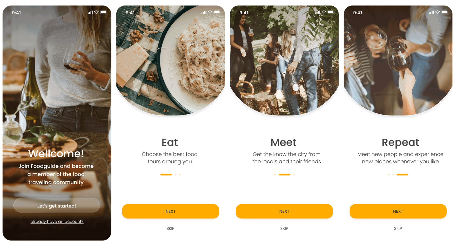
In the Foodguide app, The user can choose between a few tours, all based on different styles of cuisine or proximity to the traveler.

The challenge
The main visual challenge in this project was the fact that all the content for this project is coming from the users. I needed to find a way to keep a wholesome themed design to make the app feel consistent, even when the users are uploading a large range of content.
My process
To understand my product, I had to understand the market my product lives in, the competition in front of us, and most of all, our users. Their needs, their pain points, and their expectations. To achieve this, I had to go through a few steps:
01. Research the local experience apps field
02. Explore the competitors
03. Search for design conventions
04. Differentiate our clients and their characteristics


The research
Our users (mainly between the ages of 18-45) are using apps to travel and socialize daily, and they are looking for a quick and engaging app to help them with their traveling.
They relate to vibrating colors, video culture, and bold images.
I wanted to find fun and playful visuals that can help me make the app light, inviting but still a little intimate. I searched for the right photo filter to make the images look cohesive and consistent.
In addition, I would recommend the product team consider offering our users an in-house photographer that will keep the tours images in one main visual language.
And what I’ve learned
Typography/colors
To help the app be inviting and easy to use I used sanserif font type, and one CTA main color. no distractions, minimum overload. just-food. To help the users' content pop, I used a glass blur effect that allowed me to add text without blocking the content underneath.
I gave the images a warm and gentle filter to create a more cohesive color palette throughout the app.

Main screens
On the main screens, the user can choose a tour from the variety. There’s an explanation about the tours and the guide.
Solution overview

Filter screens
Filters the tours by subject, date, or location.

Tour info screens
After choosing a tour, on the tour info screens, the users can see all the details about the tour, the tour's guide, and other users' recommendations.

Guide info screens
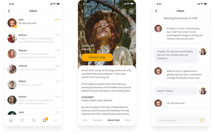
On the guide info screens, the users can get all the information about their guide and contact options.

Thank you!


bottom of page